
A study done by HubSpot indicates that businesses which use blogs as part of their marketing strategy witness a 126% rise in leads than those who do not. When a company puts more focus on blogging, its efforts are 13 times more likely to produce a positive ROI.
Your blog provides direction to your website for readers seeking more information on the knowledge you have. For it to be successful, you need to deliver content that your audience will find valuable.
However, having excellent content is not the only factor you need to consider if you want to have a successful blog. The layout of the blog also matters.
Your blog should have a design that is easy to draw visitors to the large headlines, can entice interaction, and create a long lasting impression.
But what factors should you consider when choosing a blog layout to help you attract more attention from readers and increase the number of subscriptions and conversions?
Here are some of the elements you should consider when choosing a layout that is appealing to attract more readers.
1. A Small Blog Grid
When setting up your blog, you should use a grid system if you want to achieve a clean and well-organized design. A grid system helps in creating a consistent experience to blog visitors regardless of the screen size used while viewing your content.
It helps you to space your content and boost readability for your visitors. By not using a grid system, you risk not having a visually appealing blog with content that is awkwardly placed all over the page.
You should ensure that your content grid width lies between 900px to 1100px. The measurement is made with the consideration that a majority of screens have a width of 1024px.
A grid system helps you to keep your blog neat with a healthy amount of whitespace. It also allows visitors to tell apart the different elements that make your blog.
It organizes your content, making it appealing to any visitor.
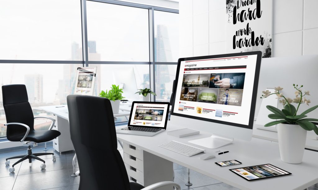
2. Large and Beautiful Images
The use of large hero images for blog cards and inner blog posts is a rising trend that you will find in many blogs you visit. A feature image takes much space and pushes the content down. However, the design is not without reason.
Its purpose is to compel visitors by making them connect to the image right before reading any content from the blog apart from the title. It also helps users know the start of the article.
You should make sure that the feature image you use is large enough to create an impact and hold enough weight over the elements that are within proximity.
You can either go with a full-width image or a smaller image that fits within the grid system, depending on what appears likable to you.
3. Using a Blog Card Layout
What happens when you create more blog posts than you can count? If you do not have a good blog design, some of the blog posts may get not get enough viewer stats as you would want.
You need to organize your posts in a way that allows site visitors to see the various content you have without feeling like you are offering too much information. To get such a result, you need to use a UX friendly layout such as a card-based design.
A card-based design uses the architecture of a card to help you organize and display information on your blog. It helps you to highlight the prominent features that will help a visitor decide on whether to read the article or not.
You can make your blog cards simple by using only essential elements such as the featured image, title of the blog, name of the author, category, date of the post, and a short blog excerpt.
You can also include social media icon buttons to give readers the ability to share the blog post.
You can put the cards in 2 or 3 columns to display the various articles you have on your blog. The short excerpts should give value to the reader and push them to click the read more button.
Several big names such as Twitter, Google, and Pinterest use the same design in their UX.
4. Choosing a Good Color Palette
One very crucial decision you have to make when deciding your blog layout is the color of your blog. The color you use will set the tone of the vibe your visitor will get when they visit your page.
The colors should contrast well, allowing the reader to read the text from any device without straining. For a more streamlined layout, you should use two or three colors that work well together.
5. Importance of Side Bars
Sidebars are essential elements to have in your blog. They can provide your blog with value, or they can become a nuisance depending on how you use them. You can use them as a navigation guide for your blog visitors.
When setting up your blog design, you need to choose which elements you want to put on the sidebar. You can choose to include a link to the blog archives and make it a valuable asset to the site visitors.
However, there are times you may not need sidebars due to the amount of information on your blog. By adding a sidebar, you may increase the clutter on your blog, making it unappealing.
The Perfect Blog Layout
The structure and layout of a blog play a crucial role in making a reader want to read more of your content. From the type of font you use to how you position images on your page, every little aspect is essential.
When choosing a blog layout, you need to have your readers in mind. You should try to find out what your readers want to see in your blog.
What colors align with the information you are conveying? Is the font you are using readable? Can you access the content from the blog?
Once you have answers to these questions, you can set up a layout that, together with good content, will help you increase more traffic and conversions to your blog.